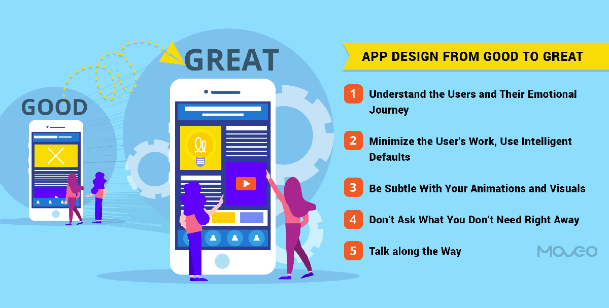
Enough has been written about good design. It’s time to take things up a notch. Today, let’s talk about great design – one that transcends the boundary of good, and pushes designers to create extraordinary experiences that redefine app design. How to create a design that becomes exemplary? Design that wraps itself around the user’s needs and intuitively provides the users all the guidance they need to navigate your app smoothly. Design that answers the users’ questions before they have to ask, and shows them the way forward before they need to search. Design that evokes the right emotion and gets users to feel a certain way. In short, design that delights your users and keeps them coming back.
Such a design goes beyond aesthetics and visual appeal. Great design gets the work done. In this post, I’m going to share with you the secrets to making your app design truly intuitive and functional, in addition to being stunningly beautiful.
1. Understand the Users and Their Emotional Journey
Armed with our powerful smartphones, we look ready to take on digitization. Online shopping, mobile banking, it all comes naturally to us. Or so we think.
The truth is that the honeymoon period of digitization has passed. Your users now need humanization. They demand seamless, on-demand experiences. Showing users that paying bills on their phones is better than queuing up the utilities office, was easy. Today, users are no longer happy navigating a cryptic internet portal just to pay a bill. Millennial and Gen Z users grew up with smartphones and don’t really care about how difficult bill payments used to be in the pre-internet era. They only expect the technology to get better. They expect mobile transactions to be as simple as handing a dollar bill and taking the groceries.
Great design is the one your users can’t see. Don’t design to show the complexities you’ve tackled to make the app possible. Design the app in a way that makes the app look like a piece of cake. Design for the simplest layman. Let all the complicated functions happen in the background, while the user should be able to get his work done in the minimum number of clicks possible.
2. Minimize the User’s Work, Use Intelligent Defaults
The idea is to give the users a feeling of having accomplished something. They should have saved time u if I am ordering a pizza, it’s clearly because I need some quick effortless food. But the food ordering app sometimes makes me scroll through 4 assorted lists, choose each topping individually, touch a dozen different buttons, and sometimes it loses all my information because of one error and I have to repeat the entire process. Now if it takes a good 15 minutes just placing my order and the 30, waiting for the pizza to arrive, I can’t help but feel that I could have rather made myself some mac and cheese.
Your app design needs to be intuitive, it needs to predict user needs, it needs to offer intelligent defaults. Think how much easier it would have been to order my pizza, if all the regular toppings had already been selected, and I could just unselect the one or two I did not want.
Design apps to do most of the work for your users. Be it typing, choosing, deciding or any other form of work, reduce the effort a user has to put in.
3. Be Subtle With Your Animations and Visuals
You want your app to be used repeatedly. You want that the users use your app several times a day, every day. So keep that in mind when designing animations, micro-interactions and visual effects. You could come up with a really lively, interesting and complex animation that looks truly stunning. But will it look stunning after the user has seen it a hundred times? When it comes to repeated usage, over-the-top, complex and multi-faceted animations could get distressing. It is safer to choose simplicity and minimalism. If overdone, animation can turn into cognitive load, so know where to stop.
4. Don’t Ask What You Don’t Need Right Away
Users don’t like to be questioned too much. If it’s not absolutely necessary, don’t ask. Enough has been written about why apps should simply do away with the login wall. You understand by now that forcing the users to divulge their email address and other personal info can be detrimental to an app. Of course apps need to get enough users to sign up, but it is better to let them use the app for a while and grow a liking for it, at which point they’ll be happy to sign up.
Similarly, not all apps need to know the gender, age or address of a user. At least not until a specific need shows itself. Refrain from asking too many questions and only solicit information that is indispensable. Doing so will help build the trust of your users, making it that much easier to turn them into loyal users.
5. Talk along the Way
That’s right, you need to talk to your users, show them the way and use positive reinforcements to encourage users to complete the transactions they came for.
Using creative copy and leading the way for your users can greatly help you humanize the user experience and help build empathy. Sam Wright talks at length about this in his article in Smashing Magazine.
Especially when yours is a utility app, as opposed to a gaming app, you know that the user is here to get something done. Be it ordering food, downloading music, buying products or anything else, most apps are work. They have a user flow that leads to the user taking an action. Using phrases like ‘thanks for coming on board, let us show you the way’ or ‘just one more step to get you on board’, can be helpful in making the user comfortable and gently nudging them to your cta. So be extra careful with your copy, make it conversational and establish a relationship with your users that will keep them coming back.
Conclusion
For a long time, design was considered as an entirely aesthetic, visual element. But today, as apps become a part of everyday lives, design is the very driving force behind how your users connect with your app and thus your business. That is why it has become increasingly important to humanize your app user experience using intuitive, predictive and empathetic design. The above guidelines aren’t the starting point of good design. I’m sure you already know those. These are the next level app design hacks that help you take your app design from good to great, so that your users love your app enough to make it a part of their lives.


