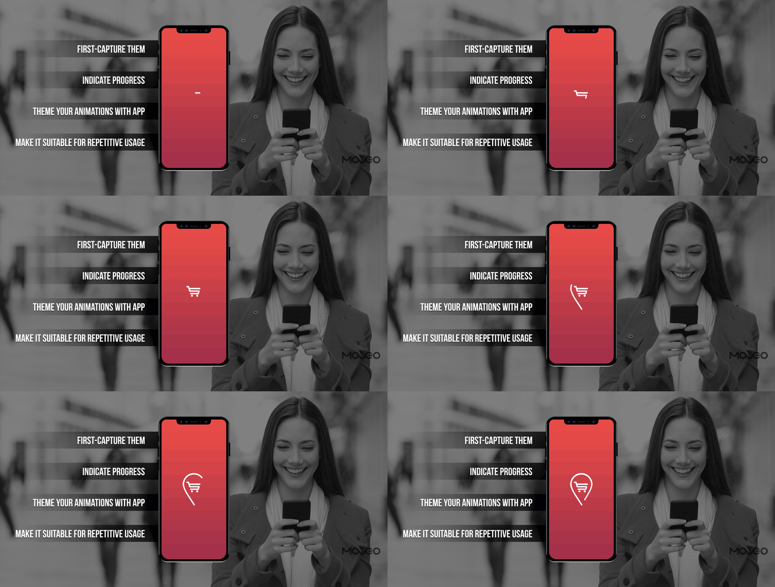
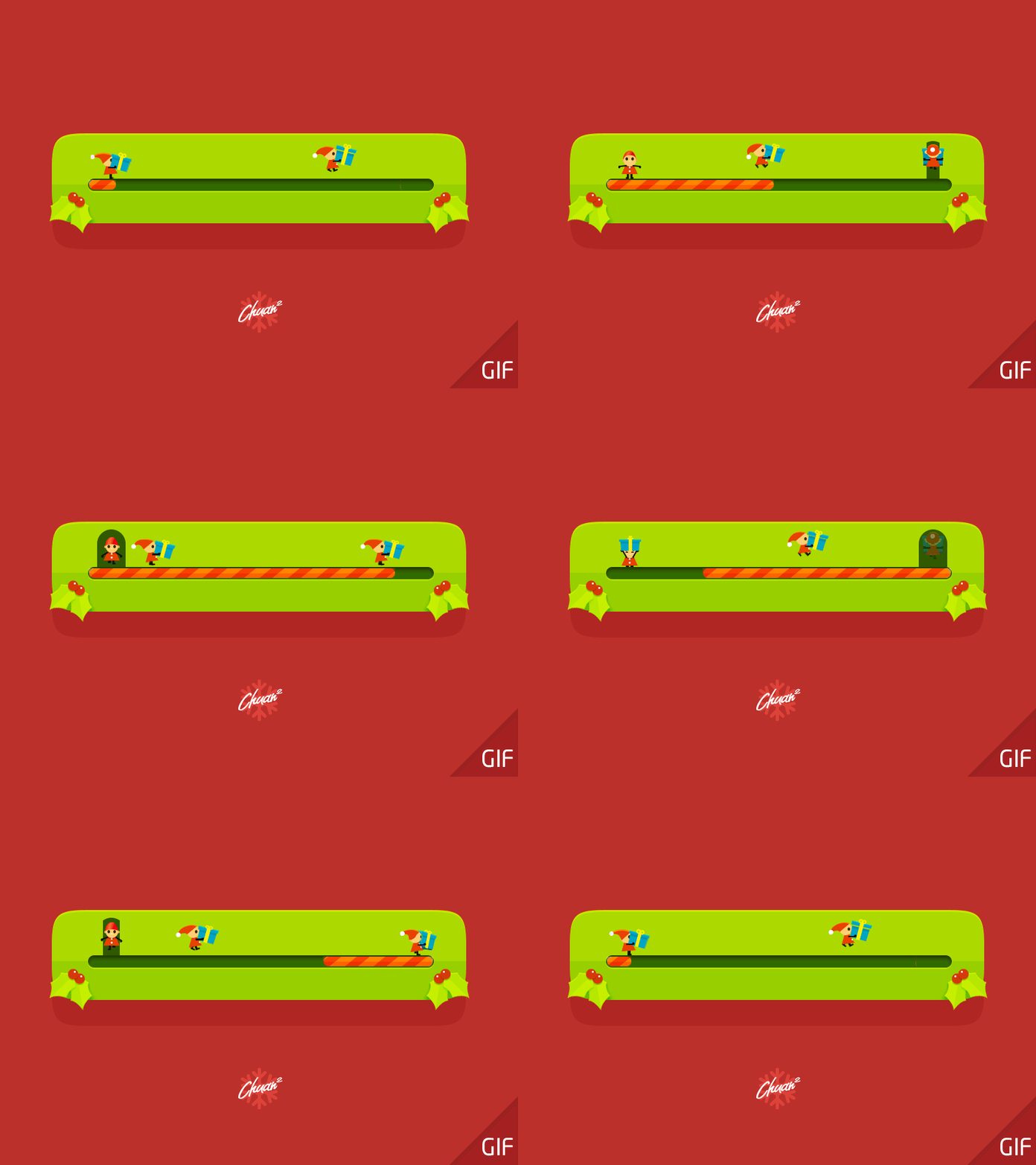
Instead of the annoying loading wheel that seems to go on forever, if you saw something like Santa’s little elves loading up tiny gifts in a sleigh, you’d be happy to wait.
The most important job an app must do is to go up and running in a moment. Studies have shown that 50% of app users find load time a major source of annoyance, and 25% would simply leave an app due to high load times.
But even if you have done everything you can to make your app load fast, you can’t always count on the connectivity to be on your side. From low bandwidth operators to people using your app in the subway or an elevator, there are a dozen reasons why your app could load slow. And as unfair as it is, you would be at the receiving end of the frustration, even for no fault of yours.
What you can do to mitigate this problem is to make your app feel like it’s loading faster. Using clever (or cute, or both) animations to keep the users engaged can help keep the frustration in check and buys you some time. You know you’ve felt it too – that quick moment of delight when you are greeted by not just a spinning wheel or loading dots, but a live, moving, breathing page that holds the promise of a great experience. From loading screens to onboarding, interacting with the app and completing a transaction, animations can buoy up your UX at every stage. But especially at the splash screen, animation can ease the user in and make them feel comfortable waiting. This happens when they are distracted by the animation to really notice how long they have been waiting and also, feel like the experience has already begun.
So here’s a primer on best practices to use animation on your loading screen and why it is great for your business
1. First – Capture Them
When the users download your app and use it for the first time, they aren’t particularly sure of what you do and how good you are. They have no attachment to your app, aren’t particularly attached to it and have little incentive to stick to it if it takes too long to load.
Yet, they have come this far, which means you’ve got your foot in the door. It’s now time to hit off with a good first impression. An awesome splash screen with an intriguing animation for app loading will do the trick.
2. Indicate Progress
Are we there yet? If you’re a parent, you know how chokingly annoying that question can be. But if you remember being a child, you also understand just how absolutely critical it is to the child asking.
With digital patience plummeting faster than a snow cone melts in the sun, your users are no less than anxious kids demanding immediacy. They need to know how far off they are and how long it will take to get there. So keeping them in the dark only adds to the anxiety. Having a progress indicator helps a great deal in soothing the fraying nerves and reassuring the user that it’s only a second more to go.
So try to design your animations such that they have a progress indicator inbuilt, or add a matching progress bar under the animation, to reassure the user and keep them engaged while you get them their goodies. I love this one called Trippy Loop
3. Theme Your Animations with the App
Here’s a good one. Some apps design their loading animations in tune with the overall theme of their apps. Like a bouncing ball for the No Halftime fantasy sports app, a moving bus for a travel app or a rocket speeding through space for…well, Anton Drokov’s Secret Project.
Creating an animation that is themed to your app does a great job of branding, because even if the user remembers little else about your app, she will always remember the animation if it managed to make an impression.
4. Make It Suitable For Repetitive Usage
Do remember here, that the animation, while unique, should also be one that can be viewed hundreds of times without getting the users bored, because that would defeat the whole purpose. The app loading animation that you design will be the first thing users see every time they launch the app. If an animation is too attention grabbing and media rich, it may look appealing the first few times, but could get boring, or even intrusive and annoying after a while. Instead, stick to something simplistic, basic and worthy of a hundred or thousand views. Appeal to an emotion in your target users – a childhood memory, a dream destination, anything that is simple yet intriguing and delightful.
Conclusion
If app experiences are about delighting users, animation is easily a game changer. With witty, clever, cute or ingenious animations, you can add life to your app and delight your users every time. Especially at the loading screen, animations hold a special power. They can be the difference between a user willing to wait five seconds, and a user ready to abandon you by the end of the third. So use the power of animation wisely. Don’t skip them, but also don’t overdo them. The above tips and examples should give you enough ideas and inspiration to jump up and add some life to your next app project. Do share with us what you came up with, or hit us up for a brainstorming session if you have a question, happy designing!


yes of course! Loading time is always annoying and it is very irritating to see a normal loading symbol. This will definitely a great feature and this make the person to be patient until the app open.