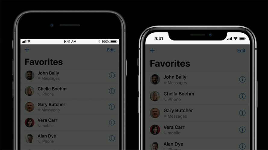
As of the 3rd of November 2017, the new iPhone X is officially here. The excitement is palpable among designers and consumers alike, as the new hardware boasts some truly fascinating properties. The almost zero-bezel screen accommodates a massive 5.8 inch display while keeping the overall body size nearly the same. So it fits just as snugly in your hand as the iPhone 8 but takes the immersive experience to a whole new level.
Now you’ve been designing apps for years and don’t need to learn new stuff every time a new phone is launched, but with hardware as progressive as the new iPhone X, there are a few new rules, ideas, and tricks to try. Here are your quick tips to design apps for the new iPhone X that make the most of its avant-garde offerings:
1. Utilize the Large Screen for an Immersive Experience
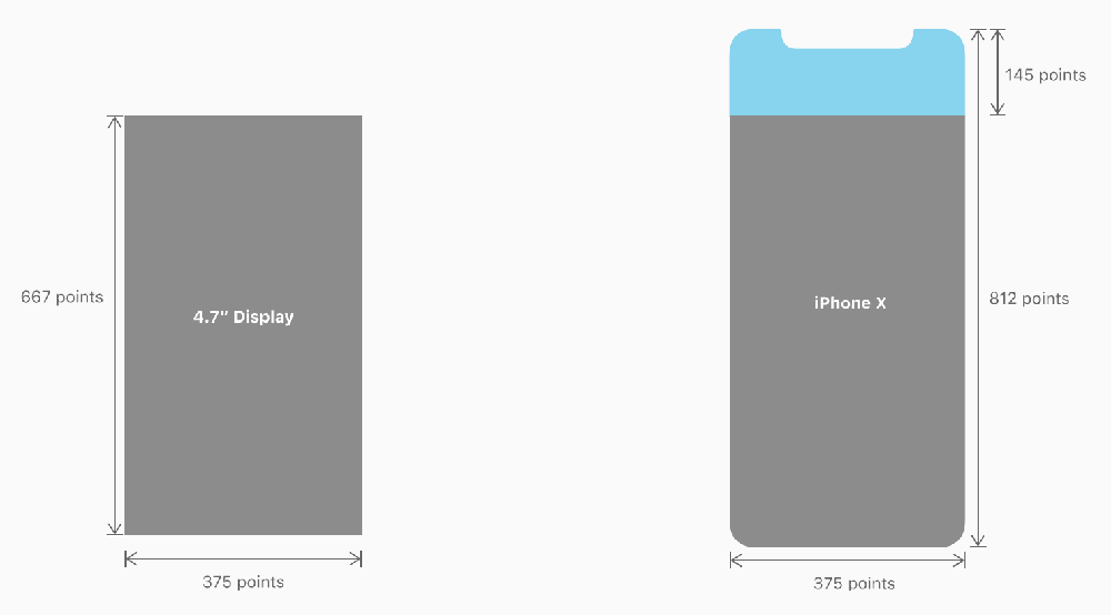
The first thing you’ll notice about the iPhone X is the large screen. The display is 145pt taller than the iPhone 6, 7 and 8, giving you about 20% more real estate to play with. To make the deal even sweeter, it has an edge to edge Super Retina Display that packs a powerful 1125x2436px resolution. So you can now use some truly stunning rich graphics in your apps. However, remember to export images at 3x to truly match up to the stellar resolution as exporting at 2x just won’t fare well. Use an artboard of the size 375 x 812 in Sketch or Photoshop.
2. Embrace-the-Notched-Shape-and-Rounded-Edges
The new display comes with rounded edges and a scallop like shape at the top center to accommodate the front camera and speaker. This little scallop splits the status bar in two, albeit the status bar has more than doubled in vertical height from 20pt to 44pt.
Apple urges you to embrace this design and make it a part of your UI instead of designing a black bar top and bottom, cutting out the round edges and creating a conventional old-world screen. Make full use of the zero-bezel, all screen immersive experience by letting your UI display across the length and width of the screen.
Since the status bar is almost out of the way, you no longer need to hide it. You can use it to stay on and display key information even in immersive mode.
3. Mind the Aspect Ratio
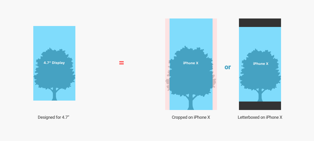
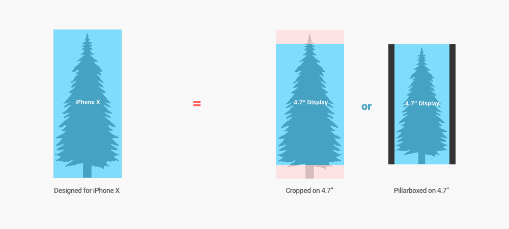
If you have been using full screen images in your app, you will need to do a little work on the new aspect ratio. The new taller display will either stretch the fullscreen image, letterbox it at the sides or cutting out key details top and bottom. This will affect your app’s visual aesthetic and also may obscure important information if it’s placed close to the edges. Pictures designed for the older 4.5-inch screens won’t fare well with the iPhone X and the idyllic thing to do would be to create separate aspects for the new aspect ratios.
4. Don’t-Obscure-the-Home-Key-Indicator
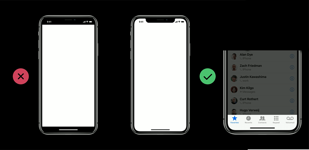
The absence of a physical home key is the one thing that will take the most getting used to. In the new iPhone X, the home key has morphed into a small black line that acts as an indicator. Swiping up from this line will take you to the home screen. Swiping left or right from this line will let you switch between other open apps.
Apple strongly urges that you do not hide the home key. It must be displayed at all times if possible. Deploy the hide and reappear upon touch action only when absolutely necessary.
In case of games, where you will need custom gesture controls, Apple gives you the option to use ‘edge protect’. This allows you to design in a way that the first swipe will invoke the app controls while the second swipe will invoke the device controls. However, Apple insists that this be used sparingly, or it can confuse the users.
Avoid placing any other buttons close to the home key indicator as it will interfere, cause false swipes and confuse the users. Keep your buttons at a safe thumb distance from the home indicator.
5. Reference the Face ID for Authentication

With the home key gone, the Touch ID is gone too. So unlocking the phone and password protected app functions cannot be performed by fingerprint or Touch ID anymore. To make up for that, Apple created some super cool algorithms for face detection. So now, users can unlock device functions using Face ID. So if you are planning to design any lock/unlock system features, be sure to reference Face ID and not Touch ID.
6. Custom Keyboards
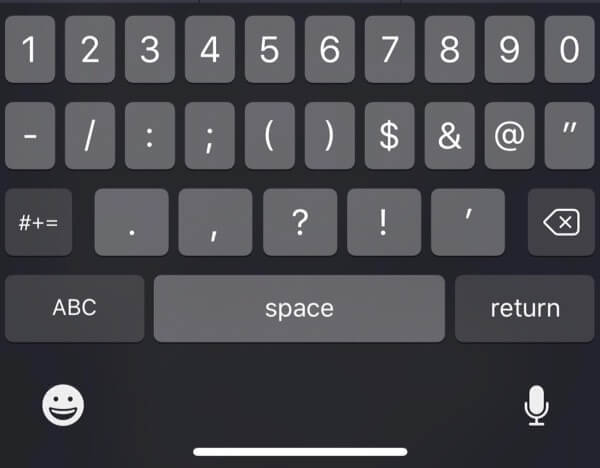
When using custom keyboards, don’t bother adding buttons like Emoji or dictation, as they will automatically added by the iPhone X.
7. Richer Colors with Display P3
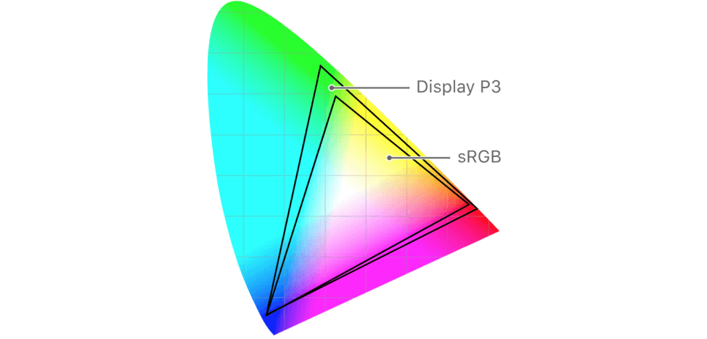
To add to the visual exhilaration of the iPhone X, Apple has introduced the Display P3 Color Space that uses wide gamut colors and vibrant, saturated tones to truly make your graphics come to life. So go crazy and give your users the most vivid apps you always wanted.
Interestingly, not many computers offer the wide gamut colors that iPhone X offers, so visualizing at the design stage could be a bit of a challenge. You could try using the Mac Book Pro for best results.
8. Explore Options Other Than the Hamburger Menu

Few things in UI design have been as hotly debated as the Hamburger menu. The taller display and ample screen space of the iPhone X means that you can easily accommodate a tab bar on your screen and do away with the dilemma of hamburger menu altogether unless you are a big fan of it of course.
9. Use Auto Layout with Safe area Layout Guide
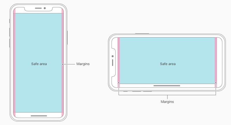
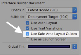
The simplest way to reduce the work for iPhone X design and getting the best results is by using Auto Layout and Safe Area Layout Guides. Doing so helps you keep the content centered so it does not get clipped at the edges and displays well in any orientation. In new projects created in Xcode 9, Auto Layout and Safe Area Layout Guides are the default setting. If it’s not the default on your system, you can enable it manually.
Wrapping Up
Wow, are you excited or what? We sure are and can’t wait to get our hands on the new iPhone X. With a display that tall and features that nifty, designing apps for iPhone X is surely going to be one hell of a ride. We hope you enjoy it and create some stunning apps. Happy designing!
Read also:Things to Consider When Designing Apps for Apple Watch


