New Year, new designs. What a happy thing it is to step into a new year and think about all the wonderful things we could do with design. User preferences are constantly evolving and a good designer is one who knows of this shift before the users know it themselves. While last year, the design was big on vibrant color palettes, emotional design, depth, and 3D, 2020 will see a shift towards more minimal design, dark themes, fluid animations and well, 3D. Let’s face it – 3D never ceases to amaze. So what else will be making waves and splashes this year? What do your users want? How will you design interfaces that look fresh, trendy and engaging? That’s what I’m here to help you with today. Let’s take a look at all the hottest trends that will define UI design in 2020, so you can imbibe these into your design and keep your apps and web pages looking fresh as ever.
1. Dark Mode
You probably heard these words being used a whole lot towards the end of 2019. The dark mode trend has caught on in a big way, and for all the right reasons. The amount of time your users spend staring at screens every day is only going up and their eyes need an urgent rescue. Dark mode offers this amazing rescue by reducing eye strain and making interfaces so much more viewable for longer durations. The dark mode also reduces pixel burn helping device battery last longer. Moreover, aside from its technical and health benefits, dark mode does a great job of highlighting your key design elements, letting the core content take center stage and give the entire interface a clean, bold and elegant look.
Every major tech company has specially developed dark mode in their devices or programs towards the end of 2020, clearly signalling the massive popularity of this theme.
Web and app interfaces too would see a lot of dark-themed designs in 2020, as users are really finding this kind of pages easy on their eyes as well as phone batteries.
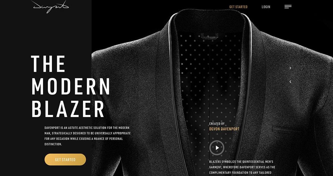
Davenport uses a dark theme with the highlighted call to actions making the UI look suave, sophisticated and minimal.
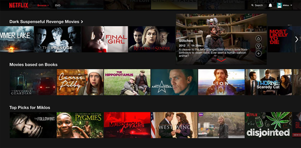
Netflix uses dark background across devices, as do other entertainment apps like Apple TV, Hulu, and Amazon Prime.
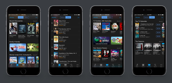
The iTunes app gets the dark theme right and truly highlights the content on display. All these examples show how dark UI design works well for the evolved, eye-strain conscious users of today and designers will find creative new ways to add color to black.
2. Designing with Sound
While the growth of voice tech has been in the works for a few years now, last year saw a significant leap in the actual usage of it. Everyone on every device was interacting more with voice commands. As a result, the technology cannot remain an archaic mic button for long and more pages will see voice become an integral part of the design.
As users become more and more experience-oriented than single-track goal-oriented visitors, they are much more open to receiving their information in the form of sounds, visuals, animations and more, no longer limited to text. And a YouTube redirect no longer remains the only way you can make users watch a video you created for them. Designers are homogenising the audio-visual experiences by designing apps and websites that organically build-in sound and movement within the interface, creating a surreal experience without leaving your app or website. Apps for instant language translation, apps that allow navigation by voice and several other kinds of apps that use voice interaction profusely will innovate to fit voice interaction and sound outputs in the primary interface.
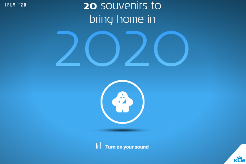
A fantastic example of this is the IFly magazine souvenir finder page below. It takes users on an immersive journey across the world, showcasing some truly delightful finds to collect as souvenirs. What makes this striking is the use of sound – a continuous background score unifying the experience while each souvenir has an audio-visual story of its own, all within the webpage. Various other websites use the combination of sounds and visuals in their interface to create a striking user experience that is more sensory than mere text and images.
Image: https://2020.iflymagazine.com/en/
3. Gradients
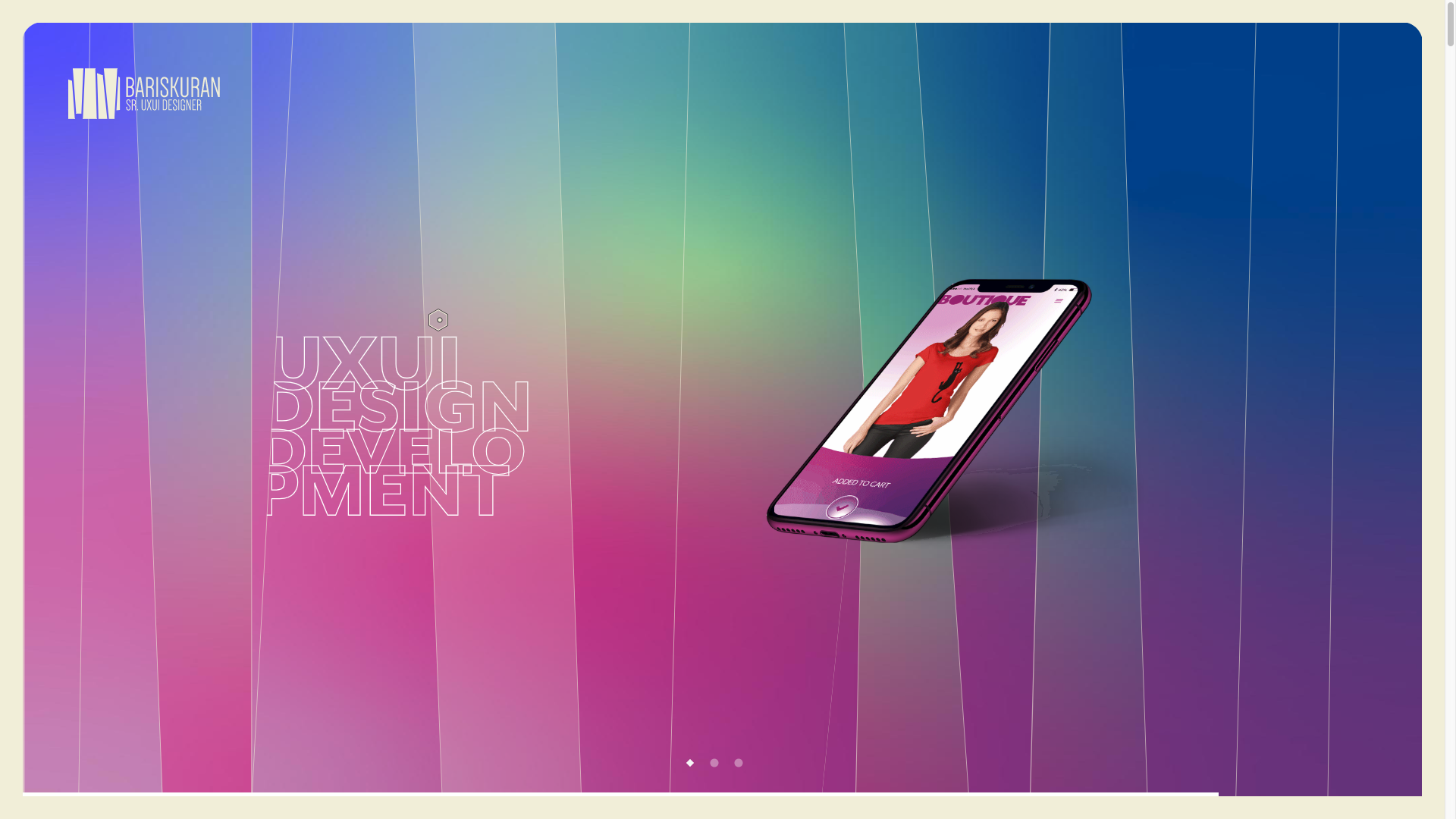
Gradients are a classic style, probably never going out of fashion. With every passing year, the trend only becomes more elegant, more sophisticated. While using a color that fades uniformly across the page creating a soft gradient was popular in 2019 too, 2020 combines the vibrancy of many different colors and the softness of gradients to create multicolor gradients that look scintillating.
Image: https://www.bariskuran.com/
4. Meaningful Illustrations
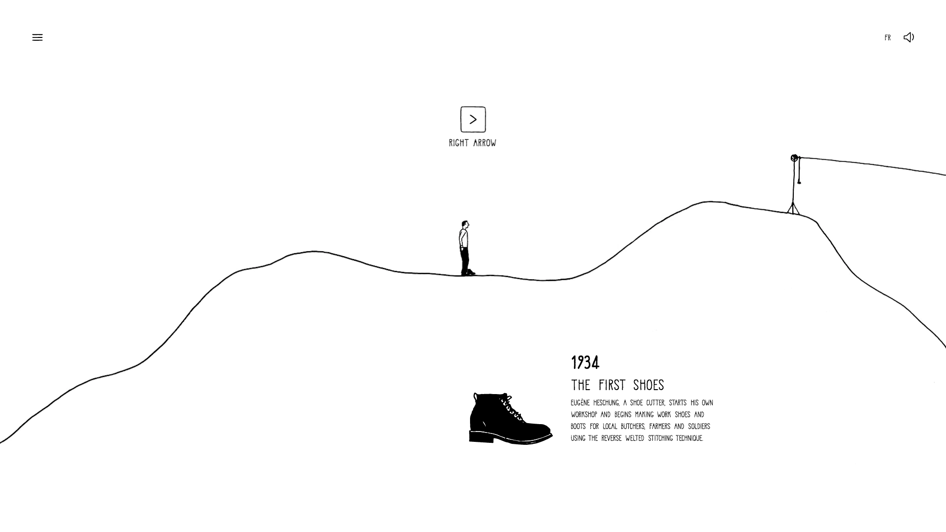
Doodles, cartoons, line drawings and several other forms of illustrations that intrigue, captivate and tell a story will make a big comeback in design this year. Be it hand-drawn illustrations that actually help the user navigate from one point to another, or spunky, whimsical doodles that look like they were just sketched on the screen, these artistic illustrations enhance the user experience by providing a truly authentic, organic and custom made feel to the user interface.
Image: https://noel.heschung.com/en/chapitre/les-debuts-de-l-aventure
Heschung, for instance, uses the above line drawing to not only tell a fascinating brand story but also to intrigue and engage the user by prompting them to click different buttons to continue the experience. The illustration is as captivating is at is minimal, really lending an edge to the design. The user cannot possibly leave the illustration midway without seeing what happened next. In addition to getting the illustration right, Heschung also scored a point in sound design, as talked about in the previous point. The illustration moves forward with some amazing sound effects. Any designer who can create a compelling illustration of this kind is sure to garner the much-deserved user attention this year.
5. Fluid Animation
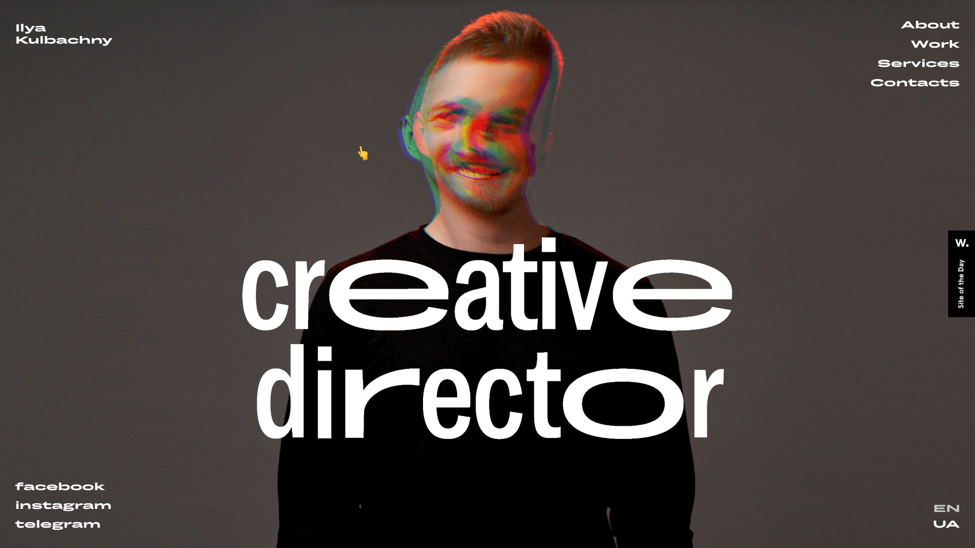
Animation has been around since the beginning of UI design and still continues to evolve and surprise. As tech and designer creativity reach newer heights, animations become more subtle and elegant. Come 2020 and a new trend that is taking hold is fluid animation. Elements on the screen show ever so slight movement, making the UI look like water or fluid. While it’s subtle and keeps your attention focussed on the main content, the fluid movements provide ever so slight refreshment an a sense of tranquillity to the immersive experience.
Image: kulbachny.com
6. Overlapping Layers
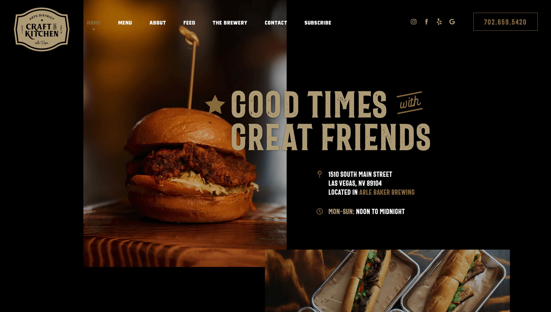
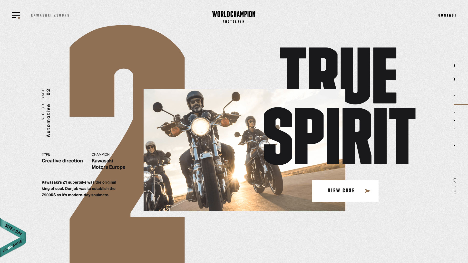
Be it the image on image, the image on text or different sections of the page over each other, overlapping layers are all set to make a statement in 2020. The effect of layering a corner or margin of one section over another gives not only continuity to the user interface but also provides depth to the design.
Image: adcraftandkitchen.com
Image: Amsterdam Worldwide
7. 3D
Like I said in the introduction, there’s no such thing as too much 3D. Since 3D technology is still in its blossoming phase, designers have so much to offer that users are going to have plenty to look forward to in 2020. Using various techniques like shadows, gradients and others to create 3D effects on ordinary devices is a big trend in 2020, as users flock to what delights them in the seeming depths of their screens. 3D allows for a lot more interaction and engagement. Using 360-degree product views for example, give online buyers a sense of satisfaction when buying. 3D allows designers to emulate the real world on a 2D device screen.
8. AR and VR
While augmented reality and virtual reality made an appearance on the UI trends lists of last year too, they are hardly a thing of the past. The drive to make AR and VR more accurate, more realistic and more engaging continues to push innovation in this area. While many online marketplaces like Ikea and Lowes successfully leveraged AR to increase their online sales, many other industries will capitalize on the unending possibilities in AR and VR. Apple’s AR Kit and Android’s ARCore are both providing designers all the fuel they need to make AR more developer-friendly. 2020 will certainly see much more augmented and virtual reality becoming a convenient part of mobile and web interfaces.
Conclusion
As we step into a new decade, UI design gets edgier, more practical and useful. Designers are leaving no stones unturned in making the design as simple as they can while cramming a tonne of functionality in the background. The above are just a few trends that will see a phenomenal surge in 2020. You will also see two or more of these trends being used together in a design. For instance, you could see artistic illustrations with sound effects as shown in the Heschung example above or gradients with 3D animation. When designing an app or website for your business, you can choose a designer who is proficient in all these trends, among others. Despite the proficiency of your designers, you can now be a part of the design process more effectively thanks to your knowledge of the latest UI trends.
Are you looking to design a stunning app or website?
Out team of experienced and highly creative designers will help build a UI that perfectly captures your business goals and aligns them with the latest trends to create a truly spectacular UI.

