The words ‘wireframe’, ‘mockup’ and ‘prototype’ are often used interchangeably, but that’s not quite the right approach. While they are similar in purpose (all three are ways to present a design), each one is a specific step in the design documentation process and serves a distinct purpose.
Gaining a clear understanding of each will help you get a better perspective of the design process and make use of each of these features for maximum benefit.
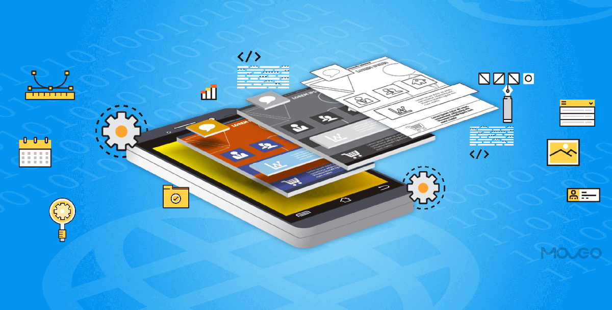
To make a quick comparison, just for better comprehension, let us consider an example. If an app were a house, the wireframe would be the architectural map or blueprint. It tells you exactly what the layout of the house would look like and where every component would go. The mockup would be a scale model. It would give you a very accurate idea of exactly what the house will look like when built. You can comfortably gauge the beauty, the quality and the utility of the house by looking at the scale model. You cannot, however, live in it.
Finally, the prototype would be the display house, or ‘model flat’, as it is called popularly. You can very well walk in, take a tour and look around and experience it like a real house before you buy a real one.
This, in short, is the difference between wireframe, mockup, and prototype. Let’s now dive into a detailed explanation of each and see how you can use them in your design process.
Wireframe

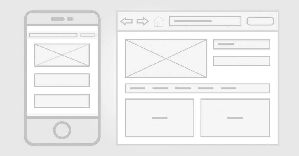
The wireframe is a low-fidelity rendition of the design and, hence, you don’t need to add any images, fonts, logos, or even text at this stage. Just the most basic symbols like ‘crossed box’ for the image, a box saying ‘logo goes here’ and ‘lorem ipsum’ for text is enough. At this stage, you are basically creating a blueprint for your app and allocating a place and size to every element on the screen to give the app development team an idea of taking things further.
When creating the wireframe, the focus of the activity should be on communicating with the team to set clear goals and get the project on track.
Mockup

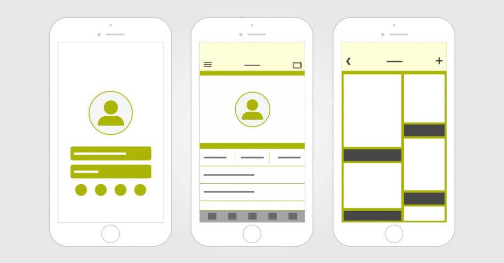
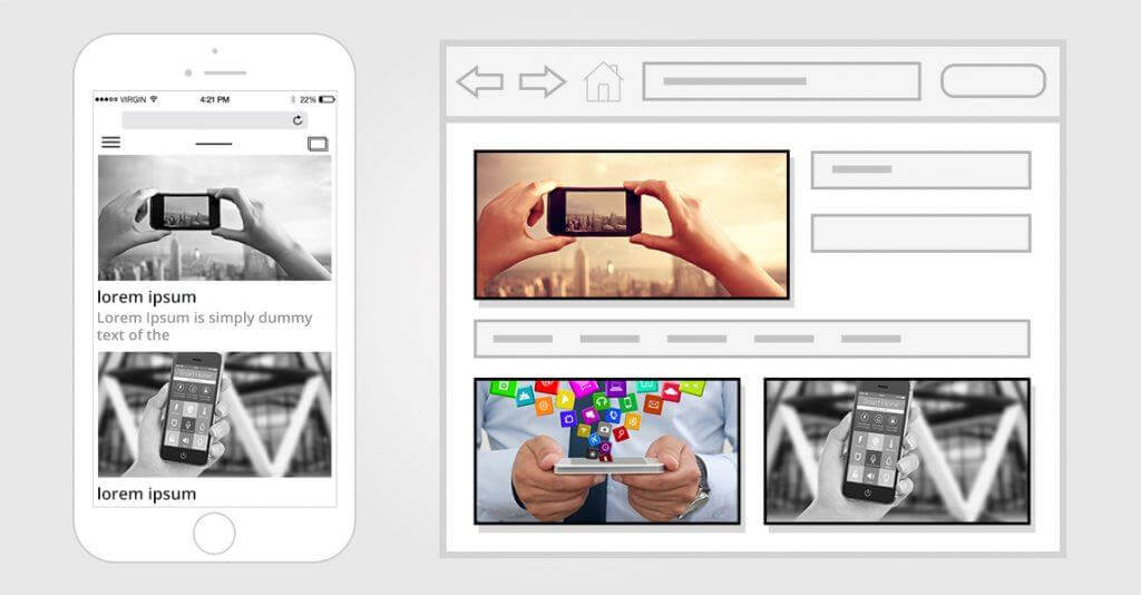
This is the stage when the look and feel of the prospective pages come alive and allows people to review the visual aspect of your design. A mockup is the best way to show your app to stakeholders and investors, impress them with your idea and get an early buy-in. It is the middle ground in design representation as it is visually more illustrative than a wireframe but much quicker and cheaper to create than a prototype. This is why a mockup serves as the best tool to gather early-stage feedback and marks a crucial step in your design documentation.
Prototype

By now, your content should be well-developed for engagement, your graphics must be in place, animations, transitive elements, and other functionalities must be accounted for and nearly ready for use.
Prototypes are expensive and take significant time to build. That is why mockups are used to ascertain the future of the project before plunging into the prototype. Prototypes are useful for user testing, where the final round up of usability assessment is performed.
Conclusion
So there you have it – a clear explanation of what wireframe, mockup and prototype mean and the significance of each in design documentation. In most projects of considerable scale, all three of these need to be used to reach a final product that impresses the stakeholders and users alike.


