The Ultimate iPhone App Development Guide for the
New iPhone X
Whether you are thinking of diving into iPhone X app development or need to update your existing apps, we’ve got you covered. iPhone X’s groundbreaking design has been the talk of the town these past few months. While exciting, the new design left developers in a scramble to make some radical changes in their UI to adapt to the new hardware. Even though the new screen is significantly larger, the new aspect ratio makes iPhone X app development tricky. The Home Key is gone and the new home key indicator offers some fancy gesture controls that could be used creatively, but also carefully. And then of course, there’s the famous notch at the top, which has received mixed reactions from the developer community.
However, with a little creativity and some pro tips, it can all be put to good use. From the absence of Home key to that ever so confusing notch, the strange new aspect ratio and the Face ID, this guide will show you how to cut the confusion and use each new feature to your advantage and design the most stunning iphone X apps.
With iPhone X, Apple has introduced some truly unprecedented design features that will forever change the course of iPhone X app development. Check out what these are and how you can leverage them to create equally brilliant apps.
Apple said, “Our vision has always been to create an iPhone that is entirely screen. With iPhone X, that vision is now a reality. Say hello to the future.”
And futuristic it sure is. With no bezel, the super large 5.8” screen comes alive in its entirety and offers an immersive experience like no other. However, even the edge-to-edge screen needs to accommodate a sensor, camera and speaker at the top. What you get as a result is a scallop shaped notch at the top of the phone, leaving the status bar split into two sections, looking something like this
You may be tempted to leave an empty black strip at the top, so you end up with a standard rectangular screen. But Apple urges developers not to do that as it hinders with the immersive experience. Instead, you can use that space to display status icons so they are tucked out of the way, displaying key information like time and battery.
Do remember to be careful at the corners too. If you display status icons or content too close to the rounded corners, they might get obscured. So leave enough safe area around the corners.
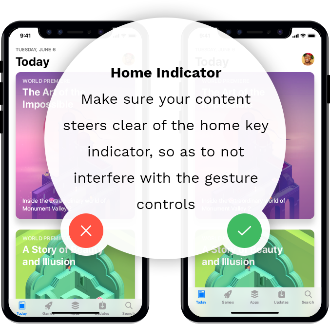
In the iPhone X, Apple has done away with the home key completely. Taking its place is a home key indicator that resides at the bottom of the screen, and has some creative gesture controls.
All of these gestures make navigation a whole lot more exciting.
As an iOS app developer, what you need to do is make sure your content steers clear of the home key indicator, so as to not interfere with the gesture controls. Having clickable controls too close to the Home can lead to confusion. So once again, leave enough safe area around the home indicator to make sure your iPhone X apps display perfectly.
Owing to the taller 5.8” display, one of the most evident changes you will feel will be in the aspect ratio. You will need to make sure that your UI fills the screen well and doesn’t get clipped or obscured at the sides or around the corners. Although most problems will be taken care of if you use auto layout, here are a few things to keep in mind that we will discuss in detail through the course of this guide.

With the home key gone, TouchID is no longer an authentication option. It’s not a big loss as you now have FaceID and it works pretty flawlessly. All you have to do is make eye contact with the phone and that’s it! You’re in. That’s the magic of the TrueDepth Camera System which is an amazing example of Apple’s cutting edge technology. And if you’re worried that this will add extra steps and make unlocking a longer process, well, it doesn’t. Multiple trials revealed that Face ID is as quick as the Touch ID and with a few cleverly practiced gestures, can be even faster. Apart from unlocking your phone, Face ID can also help make payments on Apple Pay, iTunes and some third-party apps. It shouldn’t be long before iOS developers start building apps for the iPhone X that leverage this amazing functionality.
And that’s not all. The camera that can accurately detect your face as well as sense depth becomes the first front camera to have portrait mode. That means you can take studio sharp selfies with a bokeh effect. That’s surely something to love.
A lot of people said that buying the all new iPhone X will only really make sense after about three months or so when all app developers have had the time to update their apps. Apps that aren’t optimized for the new hardware look definitively sub-par and unaesthetic, no doubt. And optimizing for the new iPhone is of course more than a little tricky. That is why the new design is getting mixed reactions from developers.
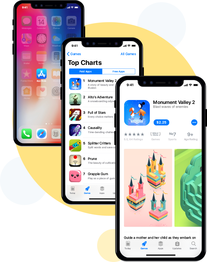
While most developers seem excited about the new design, there are those who feel that some design changes are complicated to adapt to and don’t add much value. Forums like AppleInsider and 9to5mac are full of comments both for and against the notch. It has garnered some fairly harsh criticism and some sarcasm too. Far too many developers are inclined to use a black status bar, even against Apple’s Human Interface Guidelines.
But there are those who #embracethenotch
However, most developers do believe that the notch will slowly grow on people and be less of an issue once they get used to it.
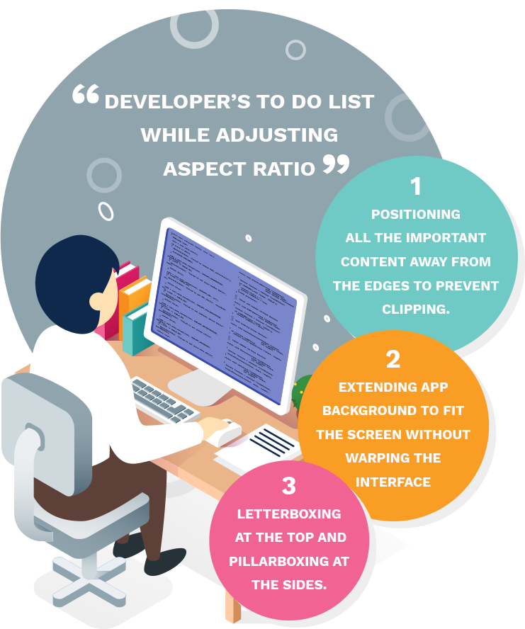
The bigger concern among a few other iOS developers is the aspect ratio. Apps designed for the previous models like the iPhone 7 and iPhone 8 end up getting clipped at the edges on the iPhone x or they don’t fill up the entire screen. Now that could be a major disappointment, for the idea was to utilize the entire 5.8” of screen. Unless the developers rework their apps to specifically fit on the iPhone X aspect ratio, apps could end up looking awful.
Of course, about the aspect too, many iPhone app developers believe that this is a change they could get used to. While some videos may get clipped at the notch, most app interfaces can be customized quite easily. Using Apple’s Safe Area Layout Guide can be especially helpful here. This will position all the important content away from the edges to prevent clipping and the app background will be extended to fit the screen without warping the interface or causing letterboxing at the top and pillarboxing at the sides.
The Home Key Indicator is another thing that’s a little tricky to get around. While some don’t mind it, others find it to be a bit of a distraction, and would prefer if it was more out of the way. And yet, Apple urges that developers don’t hide the indicator and rather, keep it on display at all times.
“The home indicator’s permanent presence on screen is a visual cue of where to swipe and allows the system to receive touch inputs faster, and start the swipe gesture more quickly than if the home indicator wasn’t there. iOS doesn’t have to worry about potentially cancelling a gesture meant for the open application. This is a big factor why the new iPhone X multitasking feels so much more responsive than, say, opening Control Center on an older iPhone.”
The Home Key Indicator is another thing that’s a little tricky to get around. While some don’t mind it, others find it to be a bit of a distraction, and would prefer if it was more out of the way. And yet, Apple urges that developers don’t hide the indicator and rather, keep it on display at all times.
The Face ID sure sees wide appreciation from the developer community. It’s hard to not be impressed by how accurate the Face ID is and how well it can identify your face, even with regular changes like beards, hairstyles and sunglasses.
“My biggest complaint about the facial recognition on other phones is that they’re not always accurate or quick. Apple’s new smartphone doesn’t seem to have that problem. Face ID recognized me quickly whether I was in a brightly lit office, in a completely dark room, or wearing sunglasses”.
The Super Retina Display is certainly something that developers are as happy about as the consumers. Of course they need to remember to export images at 3x to truly make the most of the brilliant resolution and use a large enough artboard in Photoshop and Sketch. The richer P3 colors add to the vibrancy and take the OLED display to dazzling brilliance.
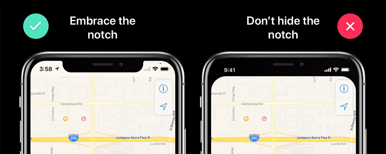
Few things in the tech world have been debated as hotly as the notch. The little cutout at the top of the iPhone X screen that houses the TrueDepth camera system splits the status bar into two, and gives the iPhone X its iconic façade. Far too many people’s immediate response to the notch was a loud outcry. ‘Steve Jobs would have never let this happen’ said many and this is simply bad design, said others. The odium is so clearly apparent that there are near-confirmable rumors that Apple is working on reducing the notch in the future editions of the iPhone X.
At the other end of the spectrum though, are people who think that the notch serves a very important purpose. The front camera has to after all, be in the front. So there simply has to be space to accommodate that machinery. To that end, the notch does a brilliant job of housing the sensors and cameras while also giving you a near-bezel-free experience. Knowing that will help you appreciate the honesty when Jonathan Ive says - “We’ve had to solve extraordinarily complex problems”.
Despite one’s personal feelings about the notch, those who think that this was a desperate attempt or a hasty design compromise on the part of Apple need to rethink. Apple urges developers to embrace the notch. They say so rather predominantly in their Human Interface Guidelines. This clearly means that they stand by the notch and want it to be celebrated as a distinct design element.
Criticisms are aplenty when it comes to the notch. The most evident is obviously the fact that the notch hinders the immersive experience that Apple so valiantly promised its fans. When you shell out $999 to view a bezel-less edge to edge display, and see that the designers took a bite out of your screen, that too right from the very top, you are disappointed indeed.
The problem only gets worse when you turn your phone to the landscape mode. List items like contacts or playlists look out of line, and photo or video viewing experience is undoubtedly affected.
Call it what you like—a cutout or a notch—but the area around the new front-facing cameras and sensors is definitely a black mark on the iPhone X's screen. In the battle over bezels (the frame around a smartphone screen), Apple seems to have gone a little too far to push its screen to the very edges of the device.
But have you seen that notch at the top of the phone? Yuck. … But based on early demos, it doesn't look like Apple is doing much software-wise to hide the notch. It should. If customers are going to spend $1,000 on the iPhone X, they should have an optional setting that places a black status bar along the top of the phone to hide the notch.
But Apple doesn’t want you to hide it. And neither do a bunch of other people who seem to be warming up to the idea of embracing the notch. So here are –
The notch is an absolute essential, insofar as it needs to accommodate what Apple calls ‘some of the most advanced technology we’ve ever created’. That little cutout up there, houses the front camera, flood illuminator, infrared camera, dot projector, proximity sensor, ambient light sensor, speaker and microphone. That’s quite a lot to cram into that little space. Surely fans can appreciate the compactness of that.
Boy oh boy did the iPhone X's notch trigger a bunch of angry nerds. … I don't mind the notch. In fact, I kind of like it, and I think it blends in nicely to the rest of the phone's software interface. The sides of the notch display the time, battery status, and WiFi and cell signals. By default, photos and video don't bleed into the notch unless you double-tap them for a zoomed-in view. You barely notice the notch in most cases, and it looks especially nice when scrolling through apps like Twitter and Facebook.
On the whole, that’s what it is – unprecedented design. Apple has been known to shock and awe its fans and everything that seems shocking at first eventually grows on users in time. The notch too, while too new to fathom right now, will soon become a pretty standard feature users come to associate their iPhone experience with.
And if you were to look at it another way, the notch does a great job of differentiating iPhone X in an ever increasing pool of bezel-free devices. As you might have noticed, more and more phones are starting to look identical these days. An all black OLED rectangle with minimal to no bezel is all you can see and it’s hard to tell which phone someone in using unless you ask them. Most people using a cover only adds to the scenario. In such a situation, the iPhone X notch serves as a great differentiator. It is an absolute signature statement that immediately tells everyone that you are using the revered thousand dollar phone.
So the consensus would be, that the notch is a decent bargain for the powerful technology it packs and in due time, will become quite an integral part of the iPhone experience, softening even the harshest of critics.
So here comes the crucial part. What do you have to do differently when building apps for the iPhone X? Well, a few things will have to be done differently. The design changes will have to be taken into account as well as the resolution and a few other changes. Sure it means extra work for developers, but thankfully, the latest Xcode 9 along with the iPhone X simulator and tools like auto layout are here for rescue. So let’s get started:
Getting started with iPhone app development on the new iPhone X requires the largest changes associated with screen size.
So here’s what iPhone app developers can do to accommodate these changes:
First of all, download Xcode 9 if you haven’t already. Download and unzip the starter package.
You will be able to see what happens when you try to display a 9:16 image on the iPhone X screen. Not quite the right fit as you anticipated, right? You need to open AspectRatioSample followed by Main.storyboard. Also set the View as to iPhone X.
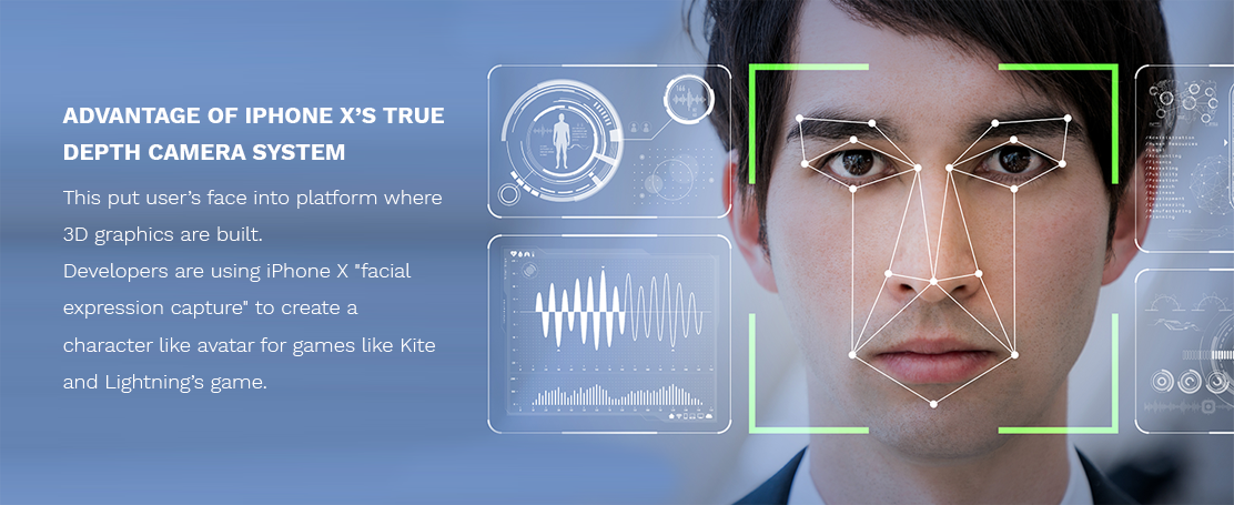
No one is exaggerating when they say that iPhone X is the future of smartphones. One technology that truly makes this statement is the very technology that nestles in the controversial notch.
Yes, the TrueDepth Camera System is what we are talking about. This revolutionary technology that can make an accurate 3D map of your face in any ambience, lighting conditions or with facial accessories is groundbreaking is so many ways.
In addition to quickly unlocking the phone, the TrueDepth camera also does a great job of mapping your face. That’s what brings the charm to the amazing Animojis that help you turn into some talking poop! And some developers have already jumped on-board to start creating face-mapping apps. While it may not seem like much at first, Elisha Hung’s winking 3D face animation is a great sneak peek into the potential of iPhone X’s face mapping.
Another example is Kite and Lightning’s game Bebylon, where the developers are using iPhone X facial expression capture to create a character for their game.
Check it out right here.
Clearly, the super advanced TrueDepth Camera System powered Face ID opens up some amazing new avenues for developers to experiment with. And what makes things even better is the possibility of apple sharing Face ID data with developers.
So here’s a detailed, 30-point checklist to cover you against all the common threats that can affect you app. Once you know the trouble spots, and have a plan to counter them, you are well on your way to a secure app that keeps your customers and you safe. At MoveoApps, your app’s privacy and security is a key concern and our app security team will ensure complete protection on all fronts, from the start to end. So if you need a secure app for your business, drop a line right here, and we’ll get back in no time.